Valentine's Day // Celebrate with heART!

February 14th celebrates love and connectedness. Like most holidays, Valentine's Day  has become an opportunity to market and sell products, but it’s hard to ignore the day and the ads, when the sentiment it’s promoting is love and friendship.  In the visual realm, the holiday is about color; reds, pinks and fuchsias, and about shape; hearts, hearts and more hearts!

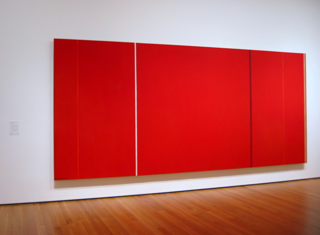
The spectrum of color symbolizes all that’s synonomous with Valentine’s Day. Red is about passion, love, desire and also energy, strength and power. Red is interesting, people love it…or they don’t. There are artists recognized for their strong use of color, particularly red. Abstract Expressionist Barnett Newman, known as a color field painter for his canvases of pure flat color that expressed his philosophies (not for this post), had numerous solid red paintings.  Vir Heroicus Sublimis, 1950-51, from his Zip Series, is in MOMA's permanent collection.

Also minimal, this photograph by Elisa Keogh captures the colors of a vibrant sunset, red contrasted with warm golds, from her Horizon series.

Anne Raymond's artwork has a strong focus on color. Clients and I  often gravitate towards her blue canvases, but for red-lovers, her paintings are very appealing. Cadmium pairs the color of the red dye itself with natural greens and golds for a strong but warm result.

Painter Xanda McCagg uses layers of color, texture and line in her work. Struck, covers this range of colors in a small canvas, 10.5"x8.5"

Shelli Breidenbach is known for her equestrian photography, which is featured in Ralph Lauren stores throughout the world. One of her series Red, is bold, she silhouettes the horses against strong colorful backgrounds to create a graphic image.

Pink, at the opposite end of the red spectrum is a softer color that also symbolizes love and romance, and in addition, caring and tenderness. Andrea Bonfils uses pinks with reds in her mixed media reference to Mark Rothko, Rothko Pink Window

The heart shape has been the symbol of love and emotion since the Middle Ages. The first recorded drawing of a heart was documented in 1250 and ever since, hearts have been and remain popular with artists and collectors. From subtle and abstract, Red February ll, in a series by  Raymond,

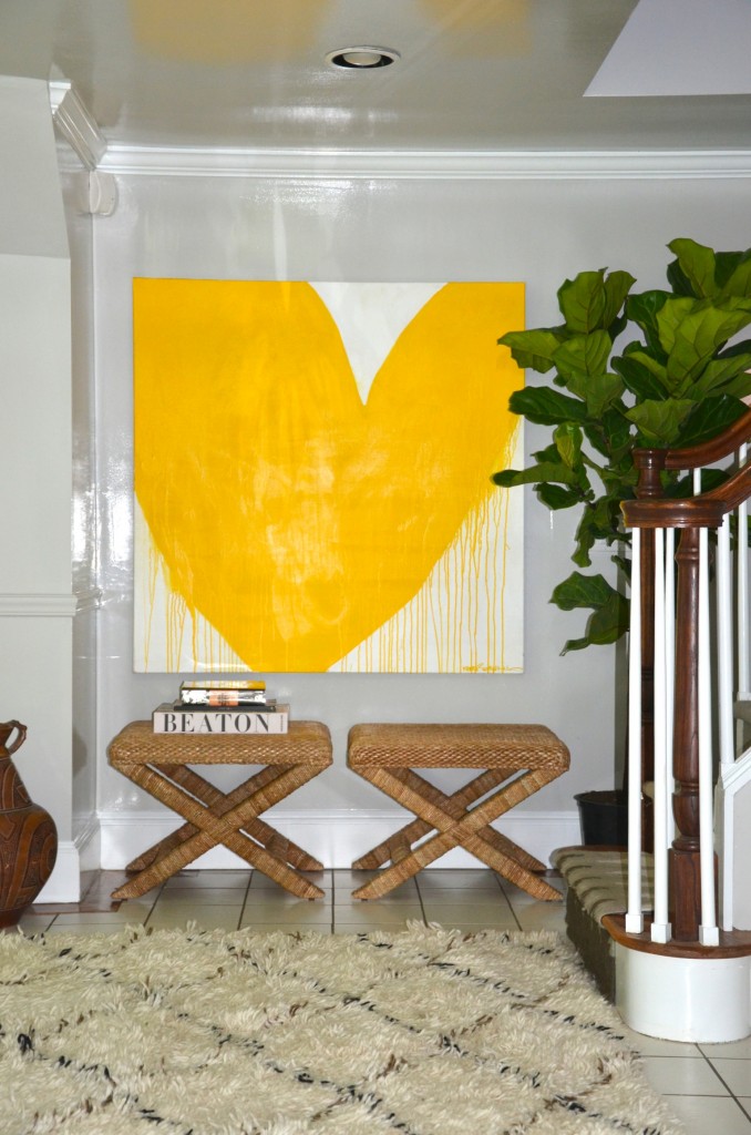
to fun and bold.  “Drippy Heart”, from Kerri Rosenthal, one of many in her successful heart series.

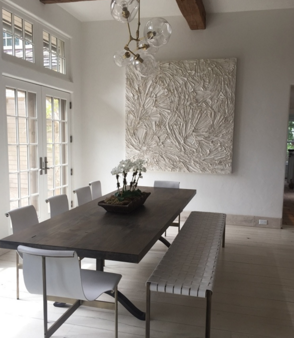
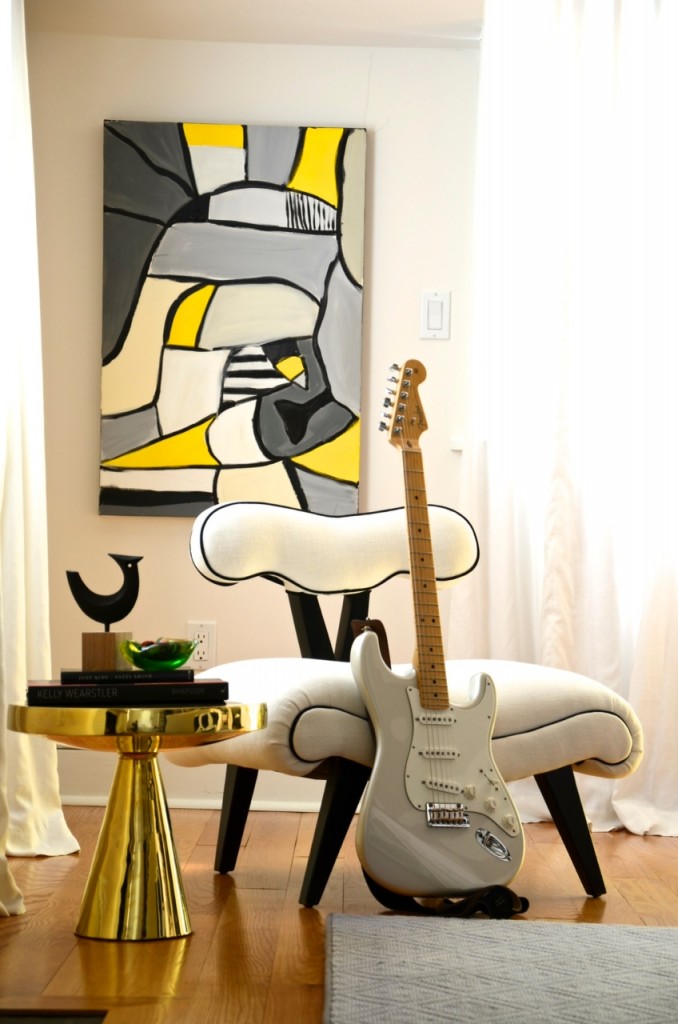
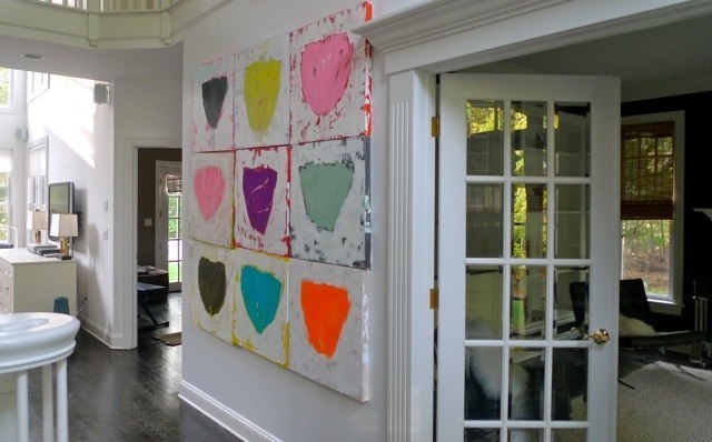
A peek at how one of Rosenthal's graphic hearts looks in a beautifully styled entry by her design firm, D2 Interieurs

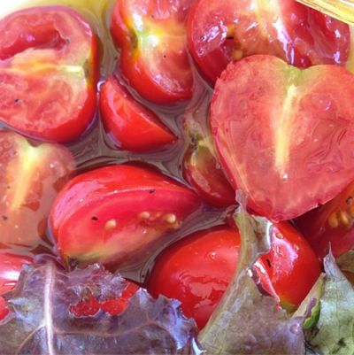
Actress Drew Barrymore recently published a photography book devoted to her heart collection. "I have always loved hearts…the way that a continuous line accomplishes the most extraordinary thing--it conveys love." Her book Find It In Everything, contains the photos of heart-shaped objects and patterns she has come across in everyday life and photographed over the past ten years, from a bowl of cut tomatoes

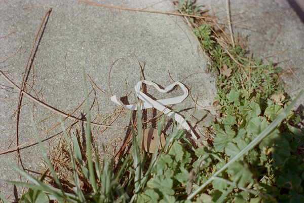
to a random paper on the street

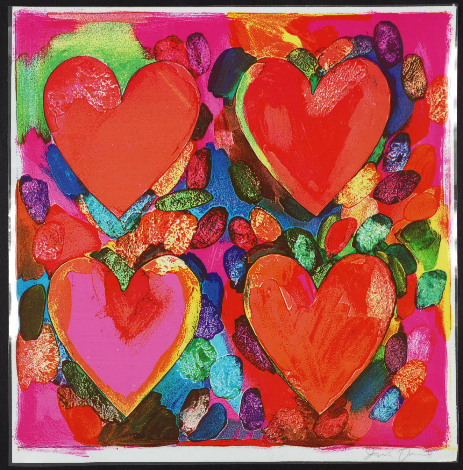
Contemporary artist, Jim Dine, is renowned for his heart-filled artwork, prints, paintings and sculptures. He combines the influence of Pop Art, with everyday objects and hearts. For Dine, the hearts function as a "sign that one can care, that there is a constant presence of feeling."  From a colorful print, Four Hearts, 1969

to the 12' Two Big Black Hearts, 1985

Valentine's Day is about feelings, and the day is drenched in warm colors; from pinks to strong reds, and visions of hearts everywhere to convey the feelings. I will overlook the ads and the commercial aspect of the holiday…because I like that it’s a day that speaks to the sentiments of friendship and love and connectedness.

And, I'll enjoy the chocolates that seem to be everywhere…Happy Valentine's Day!

Holiday Wishes // Black & Whites with a Golden Touch

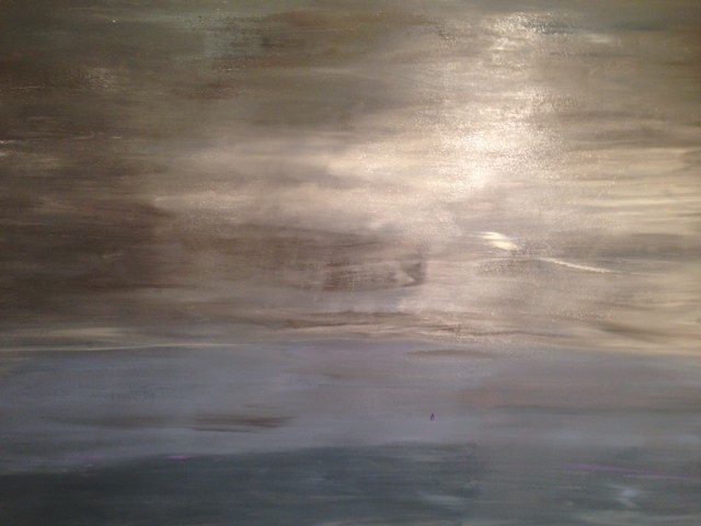
The recent snowy days inspired this black, white and neutral palette. Looking outdoors, whether at the contrast between the fresh snow, and the bare trees or the city streets and lights, this feels like winter. The artworks on our holiday card are without color, whether oil painting, mixed media or photography, they are soft shades of white or the high contrast of classic black and white, touched with golden snowflakes! Anne Raymond's paintings are usually filled with strong color. Never Late has color, but in a very subtle way. Raymond captures the various whites of winter, complimented by warm and natural colors of nature.

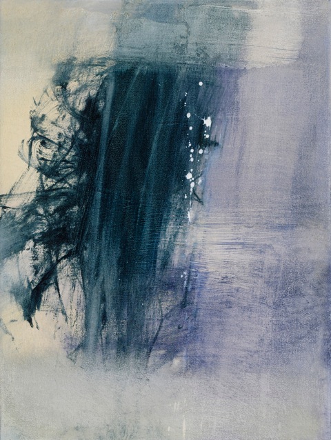
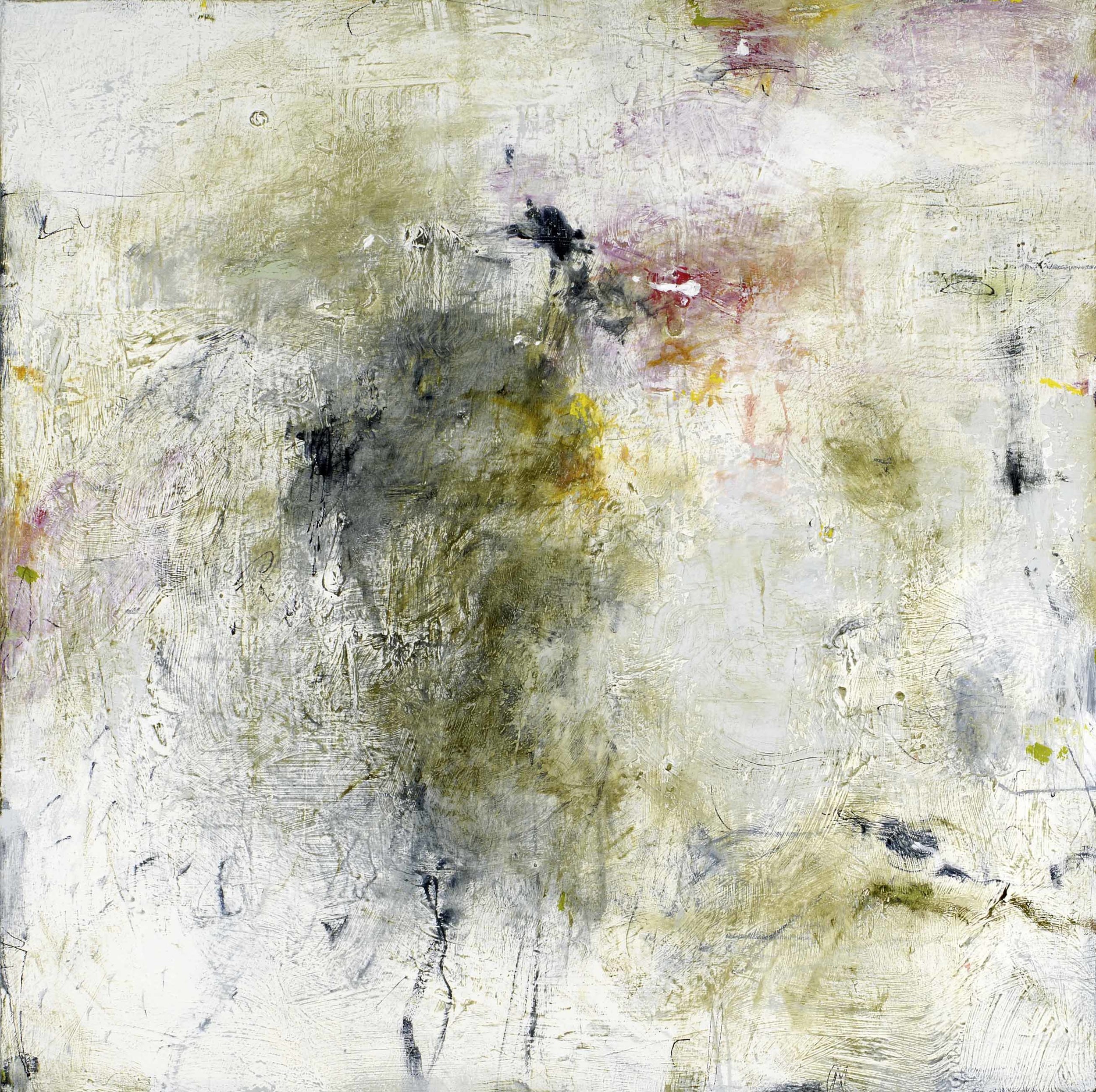
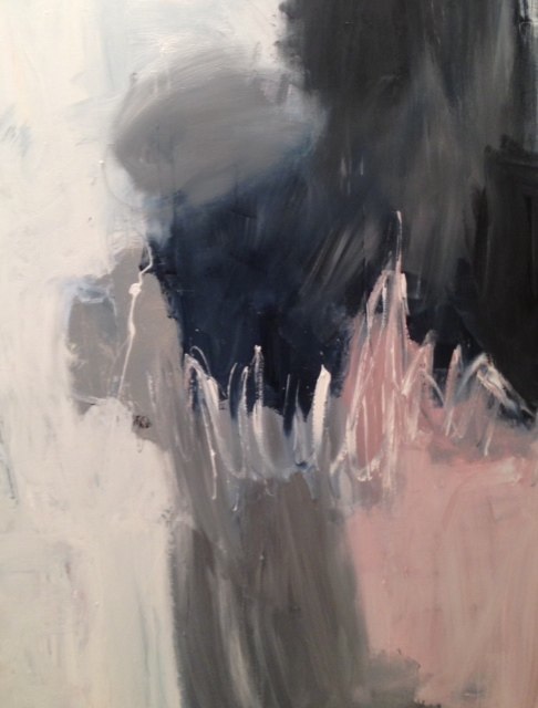
A quiet painting is a departure for Xanda McCagg as well. Her canvases which use line and form as an abstract expression of larger experiences are usually strong and vibrant. In Touched, the subtle monochromatic shades of grays, whites and tans, with graphite lines, are just as layered as her more colorful work.

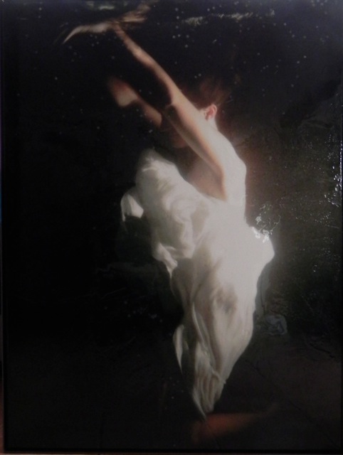
In Lightness, Andrea Bonfils layers encaustic wax to add more depth to her gestural underwater photograph, creating a floating and ethereal effect when contrasted against the dark ground.

A client hung a triptych of Bonfils underwater series to beautifully compliment a white living room by Heiberg Cummings Design.

In Africa, Stuart Zaro captured the natural graphic beauty of these zebras. Zaro’s intertwined Zebras No.2 , from his Game Blue Collection, are a reminder of the gentle and stunning beauty of nature.

The simplicity of black and white makes a statement. Kerri Rosenthal, a painter recognized for her bold and creative use of color, also does a strong collection of black and white works.

The contrast of the opposite colors provides an appealing tension, whether it’s in a photograph, painting, a room or fabric. Take a look through my Pinterest board for more black and white inspiration.

Surfer Girl, an iconic image from Bramasole Photography, by Christine Wexler captures the beach and summer at its best. On these wintry days, I love looking at Wexler’s beach photos - they capture carefree, warm summer daysHoliday calls for some sparkle and shine! The Swarovski Snowflake, the huge twinkling crystal above Fifth Avenue and 57th St. is a sparkling ornament with a purpose, “It’s a special symbol for the world's most vulnerable children. It hangs as a reminder of UNICEF’s commitment to reach a day when zero children die from preventable causes.”

Wishing you a very happy holiday and peace and good health in the New Year!

It’s a New (art) World // art & Amazon

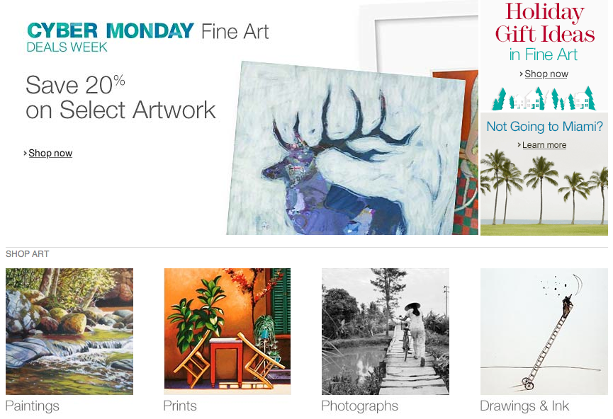
"Amazon prides itself on disrupting the traditional way of doing things". This was Charlie Rose's introduction to his recent 60 Minutes interview with Jeff Bezos, founder and CEO of Amazon. The question many in the art world are asking is whether Amazon will disrupt the way business has traditionally been done in their industry.


dis·rupt  \dis-ˈrəpt\: to cause (something) to be unable to continue in the normal way : to interrupt the normal progress or activity of (something)

The fact that this question is being asked seems to tell the answer. Since the launch of Amazon Art in August there has been lots of conversation, pro and con as to whether the world's largest online retailer can be successful selling art.

Since its launch in August this year, Amazon Art quickly became the largest global art seller. According to a New York Times article, Art Collections a Click Away, they launched with “180 galleries worldwide on their site, offering for sale over 43,000 artworks from 4,500 artists…to  their 100 million customers in North America and 225 million customers worldwide.” Selling art in the same way they sell books and toothpaste presents the question of how it will be perceived, and whether it will be successful.

The NYTimes quoted Art Tactic, referencing their survey of galleries, they found that  “89% of those surveyed sold art online”. This is not new, it’s just being exploded on a large scale by Amazon.

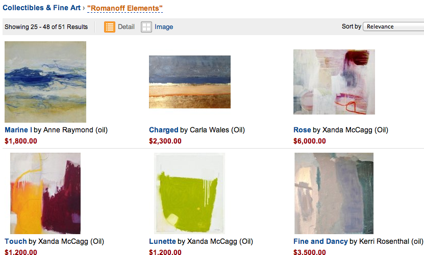
Giving the Gift of Art, a recent Wall Street Journal article details the numerous art sellers offering art for this holiday season ranging from an $18.00 Andy Warhol soup can puzzle to an $18,000 Warhol screen print. On Amazon, there are Warhol's listed for up to 35 million dollars!Romanoff Elements evolved from an interest to make art more “accessible” - to create an ease for buying art and to bring art to where the customers are. Time is a valuable commodity, and many are not interested in spending theirs browsing galleries and art fairs. Even for those who love art, they may not choose to spend much time shopping for it. It makes sense. Shopping for art online doesn't take away from the galleries and fairs, in fact, it has the potential to create new art customers, and more possibilities for collectors.

Naysayers talk about the importance of seeing art in person, the relationship with the dealer and learning about the artist and artwork. All of this can be done with online conversation and discussion. Criticism is often focused at the highest end of the art market. Yet, according to Business Insider, “Out of some 40,000 items (listed on Amazon), including thousands of original works — 18,000 are under $1,000 and 29,000 are under $5,000”. The focus is not on the much discussed 1941 Norman Rockwell’s painting, “Willie Gillis: Package From Home”  listed for $4.85 million, rather on those items listed for under $5,000.

The question of how an artwork is represented by it’s photo is a good one. Can the color, depth and texture be fully appreciated on a two-dimensional screen? A part of Amazon’s disruptive behavior is to guarantee returns within 30 days. Individual galleries have varying policies regarding this, but the artwork can go back. This eliminates a lot of uncertainty.

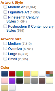
The presentation of art on Amazon has been criticized for not being “upscale," not being  “refined” as it should be for the creative process of looking at and buying art. Business Insider addresses what it does right though, “The real upside of shopping on Amazon for art…is how user friendly it is: You can search by color, size, price, and even subject.” Other art sites, it claims, are not as, “inherently easy to navigate.”  Again,Amazon can apply its successful formula to yet another category.

When you browse through photography, you can select an image, the size of the image, and the matte and framing options

and you can see how the artwork will look to scale in a roomAmazon, a data-driven business entered online art selling because they established the growth potential among their customers. Bezos described their "consumer centricity… that they don't want to erode the (consumer) trust" to Rose in the December 1st interview. If anyone can be responsive and create a way to sell art online, Amazon will. They will respond to feedback, take their time and thoughtfully develop a way to serve their market.

They are working to ‘de-mystify’ the process. The dealers and galleries that have joined the site, sell their work elsewhere, but agree that Amazon can help reach many more (millions) of customers than they can through more traditional channels. Stephen Tanenbaum, Co-Founder of UGallery told Business Insider, "We sold a piece of art to Germany this morning and another one to California…As word starts to get out, I think people are giving it a shot."

Romanoff Elements is “giving it a shot” also. We look forward to the potential of attracting new buyers from throughout the world.  Please visit our gallery on Amazon Art, scroll through and experience this new (and disruptive) art shopping and buying experience.

Orange // & the Natural Beauty of Fall

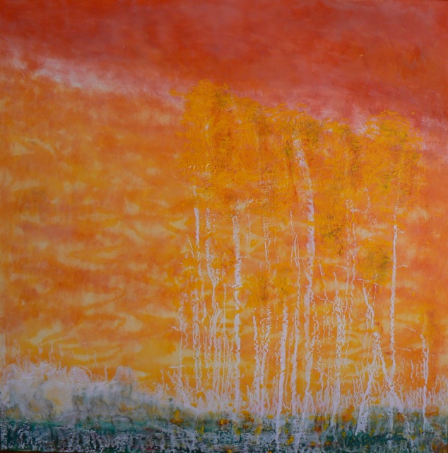
It's been a spectacular fall, the weather and the colors of this season seem far more intense than in recent years. The natural beauty has been the topic of many conversations, Instagram pics and Facebook posts recently, so before it’s gone, I want to share some thoughts on the colors, and the beauty of autumn. Artist Andrea Bonfils captures the season's colors and texture in a combination of oil and encaustic wax. Falling Leaves, from her Nature in Wax Collection,

Orange is the color mostly associated with fall, mixed with the many hues of yellows, to golds to browns. A recent Sunday morning walk revealed all of these colors, contrasted with the incredible rich colors and reflections in the lake at a friend’s picturesque Northern Westchester home

Artists have always been inspired to capture this natural beauty.  I love how Wolf Kahn expresses nature in his work, Orchard Patch is his view of fall,

Orange is named for the fruit, but has come to mean many things, different in various cultures. In a recent yoga class, my yogi talked about the 2nd chakra, as the source of creativity. In another breath, she, like so many of my friends referenced the incredible colors around her during her morning walk, "there is orange everywhere -- like the trees are on fire"


Many Masters have been known for their use of orange, among them Gaugin, van Gogh and here is Venice Twilight, by Monet

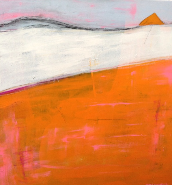
Octave is one of  Anne Raymond's orange canvases, inspired by the natural colors near her Hamptons home,

Color consultant and Executive Director of the Pantone Color Institute, Leatrice Eiseman, explained the choice of orange last year as Pantone’s Color of the Year 2012, as “a spirited reddish orange...continues to provide the energy boost we need to recharge and move forward.” Orange feels that way, it has energy.

I have described Kerri Rosenthal's color-filled paintings as happy and full of life  - an example is Nice 2

It's a classic color, it works as a beautiful contrast to quieter shades. Orange has become syononomous with the luxury retailer, Hermes.

A search of "Hermes Orange" brought up 62,110 posts on the home decoration and renovation site Houzz!


Orange as a fashion statement  has found its way into popular culture this season. The name of the new series, “Orange is the New Black”  has started a marketing trend, being used as a reference in interior design and fashion and I imagine in other fields as well.

In the NYTimes Style section last month, Bill Cunningham captured Le Grande Orange

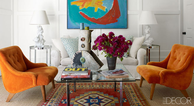
Elle Decor referenced it recently, about the a pair of vintage Italian armchairs upholstered in pumpkin orange leather, in designer Cynthia Frank's Southampton home

And of course, this week is Halloween...a celebration of fun and scary things, all in orange and black. Feng Shui, attributes orange and black used together for the holiday because they are on the opposite ends of the energy spectrum. “Orange is a very lively and happy color, the color of fall bounty and the warmth of fire, it is often called the ‘social color’. Whereas black reflects mystery and void, the color of a space with no beginning and no end, filled with mystery, it holds the energy of power and protection.”

Photographer Elisa Keogh captures this contrast in Norwalk, CT orange-black,

and how fun is Tiffany’s "Spooktacular" wink in this past Sunday's NYTimes?

The leaves are starting to fall, it ‘s time, it was a beautiful and long fall season, I hope you enjoyed it as much as I did...

Happy Halloween!

Color First // Creative Kerri Rosenthal

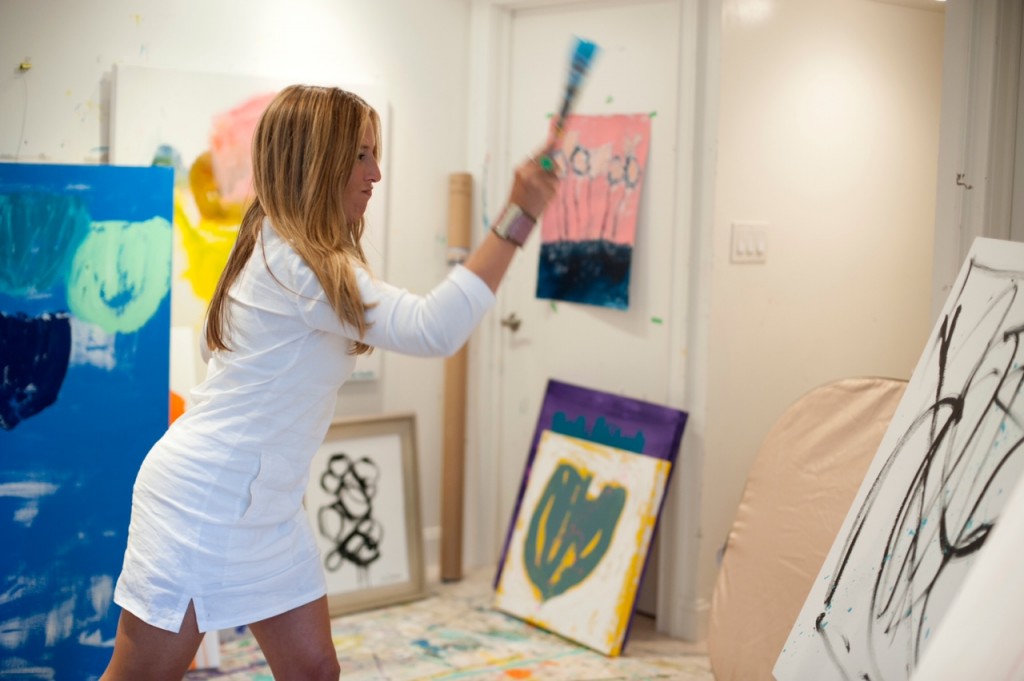
I want what she’s having...and what artist Kerri Rosenthal is having is a serious dose of creative fun that’s making her and her client’s happy. While talking to Kerri about her work, her inspiration and her process, I smiled because her “happy” talk is contagious.  And her paintings exude the same positive energy that she does.

I met Kerri a bit over a year ago after we both installed artwork at Nest Inspired Home, a home furnishing retailer in Rye, NY. I realized I was familiar with her work, I had seen it at several Connecticut stores that have been steadily selling her work, work that’s defined by color and energy.

She has been painting for only 5 years, and in that time she has established a strong following in and around her local Fairfield, CT home and studio and well beyond, throughout the country. I was curious to learn how she managed to do this so quickly and beome a “go to” source for many interior designers and clients.

Kerri’s Pinterest page has over 3500 followers, that’s an impressive following for an independent artist, and she sells her paintings to fellow 'pinners'. Her presence in the design world has evolved into a thriving interior design business as well. She infuses her interiors with the same sense of color and  pattern, sometimes bold, sometimes quiet, as her canvases.

Early on, after studying fashion and merchandising at NYU, Kerri’s creative interests were focused on fashion. She spent a few impressionable years with the Oilily, a Dutch apparel company that was synonymous with exuberant color and pattern. Time spent traveling throughout Europe and in their “creative and color-infused headquarters" in the Netherlands had a lasting impact.

After a break to have her 3 children, a random dinner out provided a spark of inspiration that created a new future for Kerri. Sitting in a restaurant one night, Kerri was moved by some beautiful paintings on exhibit. The next day, she bought her first paintbrush and supplies to try to recreate what she saw. She hasn't stopped painting since! She is self-taught - something that allows her the freedom to grow as an artist, without limitations.


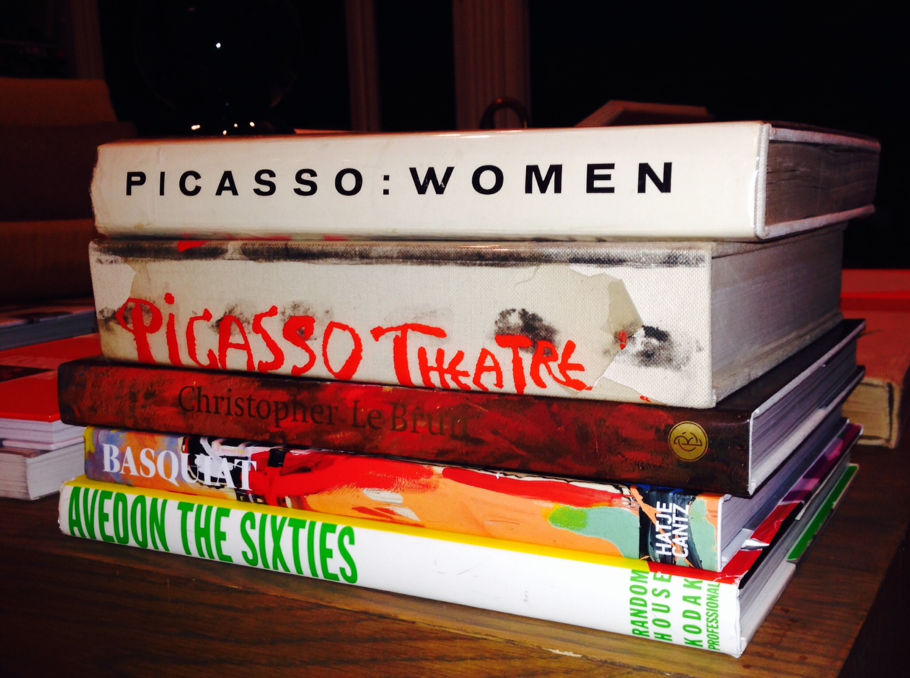
Inspiration comes to Kerri from a myriad of places. A serious book collector, Kerri’s many art & design books provide endless pages of ideas.


The exposure at Oilily re-surfaced along with other influences on her color and style; artists Wolf Kahn, abstract expressionists Willem deKooning, and Helen Frankenthaler, various Impressionist painters and recently artist Cecily Brown. Kerri added that it's are way more, a Vogue fashion spread, a piece of jewelry or the natural beauty of outdoors can just as easily inform the colors and direction of her work.

I asked Kerri why she thought people respond so positively and immediately to her work. Color is the basis of her paintings and interiors, “Color speaks to me, when it's right, the colors dance, they sing and give you an incredible feeling, like a feeling of first love”.  She talks about our sensory gut reactions to color, people's need for color. The color in her work comes from deep within, it makes her happy, and others in turn, tell Kerri, that her paintings make them happy.

Many of Kerri's clients have multiple pieces. The variety of her work has allowed collectors to buy from a few to up to 30 pieces!

It's fascinating to me to watch people react to color, to literally see a beautiful flower, a sunset or piece of art that makes them smile. I have written in this blog about specific colors, their meaning and why and how certain colors appeal. I see it with Kerri's work, from her soft, moody landscapes with subtle color, appropriate for a candle-lit dining room or quiet corner,

to her brighter, more vibrant work, suitable for kids rooms and family-centered spaces

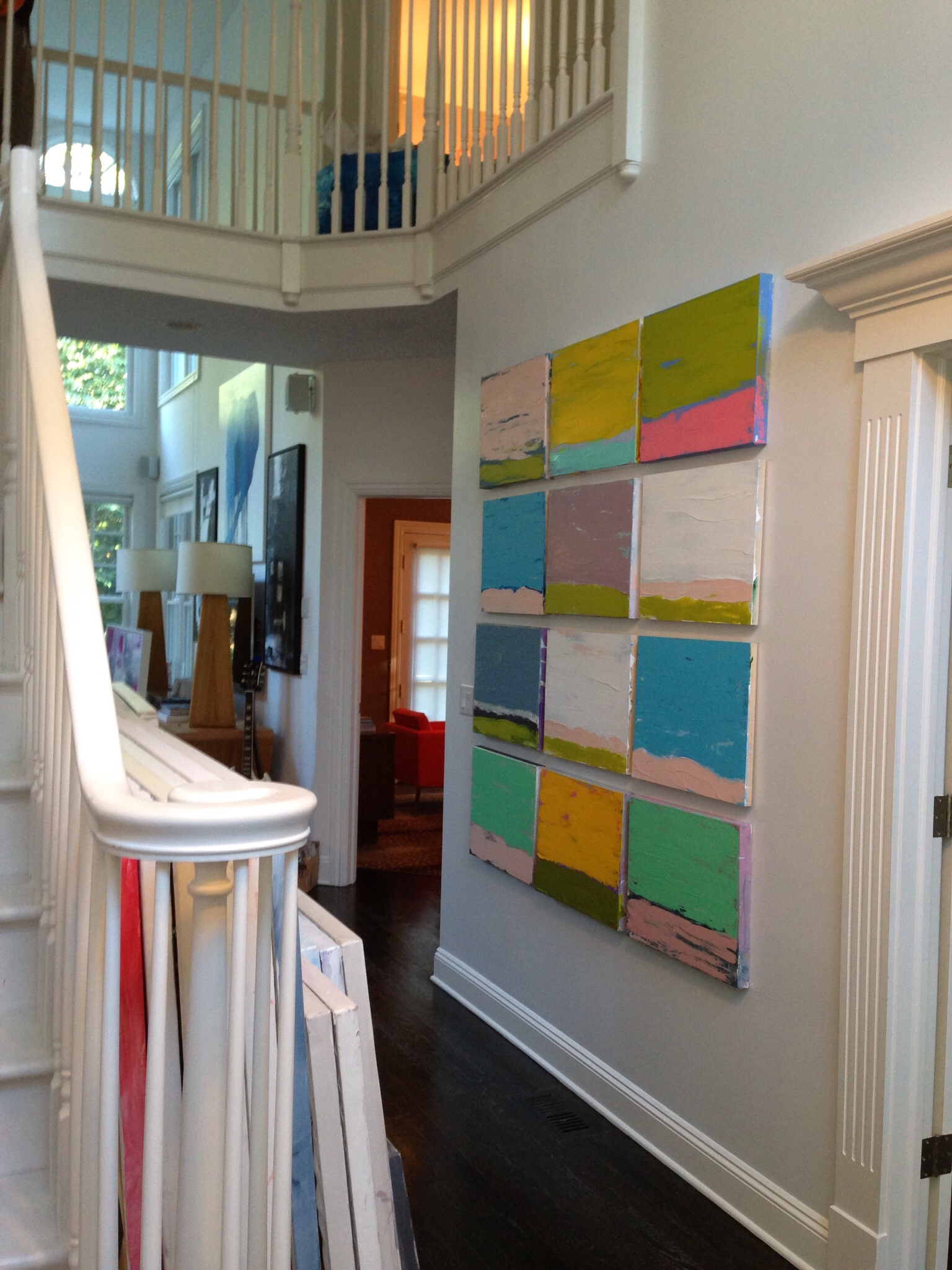
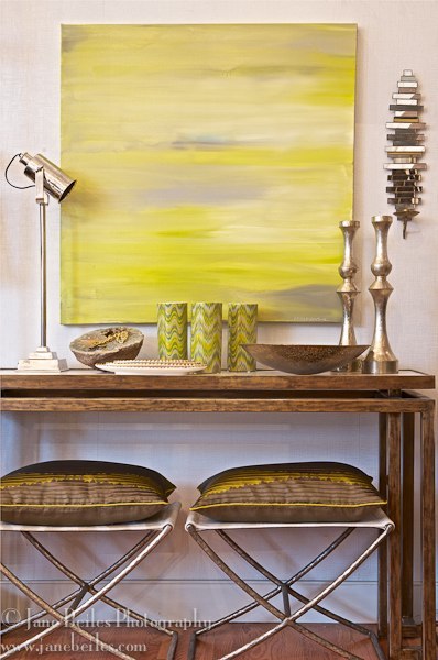
or used as an accent, in a foyer

or a beautiful vignette.

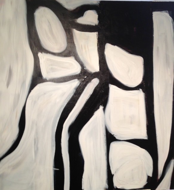
even when she paints with black, Kerri adds white for contrast to create movement and energy.

So, I’ll take what Kerri’s having...she’s energized by creating her paintings, and thrilled that her clients and collectors fill their homes with her work. She has found “it”, an elusive, and very personal factor that drives her creativity to produce work that makes people smile. Kerri calls it the “happy factor”.

Please join us this weekend for a trunk show at Spruce at Mariani Gardens in Armonk, NY, Sat and Sun 11-3. Stop in to see Kerri’s color-infused paintings firsthand!